Branding policy editor
Walkthrough
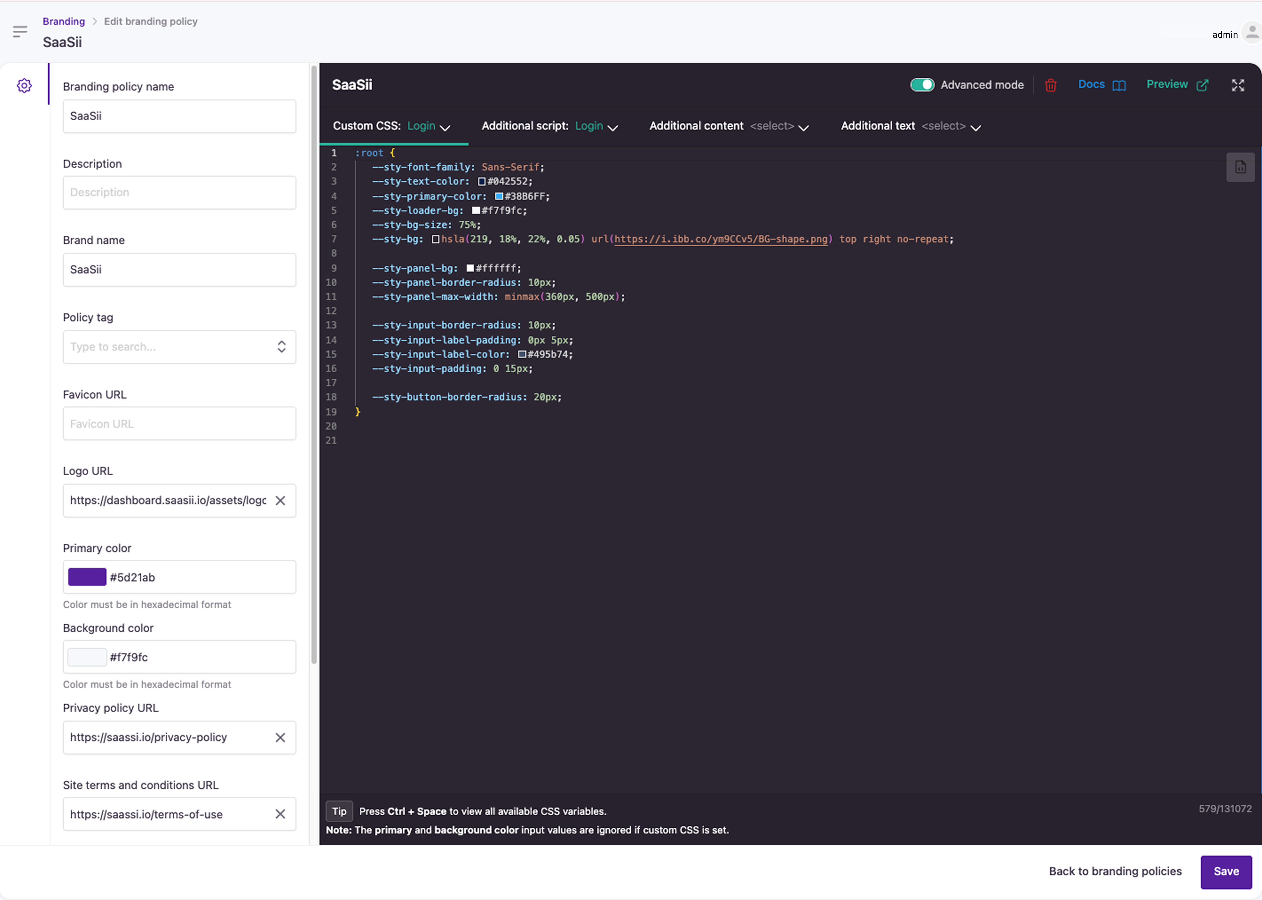
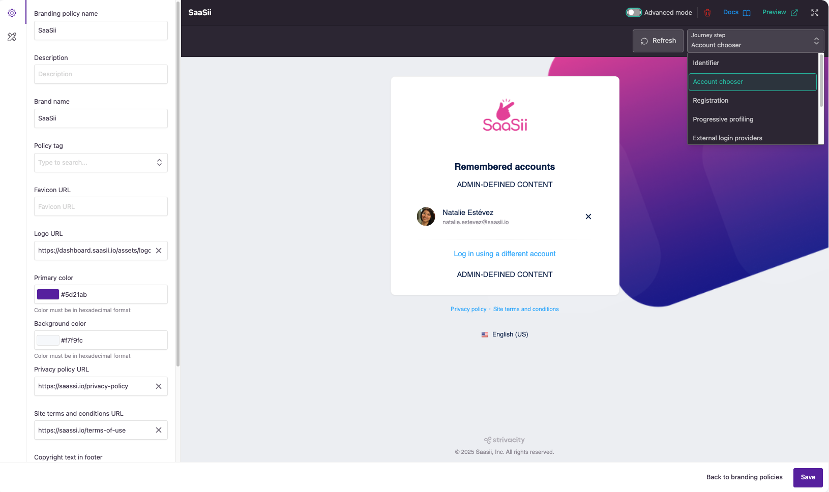
When entering a branding policy, the first thing you see is the general settings and the journey step preview. You can display the style editor with the pencil-ruler icon to add custom CSS. You can switch on Advanced mode to access further options, such as additional texts for customer experiences, an HTML editor, code snippets, and a scripting environment. You can check your advanced changes on a new tab by selecting Preview.

Branding visualizer
General settings
General settings allow you to quickly add the most essential styling and custom communications to your customer experiences or link off to your brand's user agreements.
You can learn about general settings in more detail at the link.
Preview
You can make sure your customer experiences look exactly how you want them to be before going live.
The branding policy editor shows how your branding toolkit, CSS, or HTML renders. The interactive preview area displays real-time updates applied to different parts of the customer experience.
Available previews:
- Identifier
- Account chooser
- Registration
- Progressive profiling
- Extra login providers
- MFA enrollment target selection
- My Account
- Access denied
Customer journey previews are available in two places: in the brand visualizer's simple mode and on a different tab using the Preview button. You can switch between previews using the journey step drop-down:

Customer journey previews
The UI elements in the branding visualizer are static.
Sample elements in the editor only respond to branding changes but are not affected by how your application is configured. For example, the example social login providers will not change in the editor by assigning the branding policy to an application where different providers are configured.
Docs
The Docs button in the branding policy editor links to a detailed reference that supports more advanced customization. If you're working with layout structure, CSS, custom scripts, or translation handling, this resource helps you go beyond the basics.
The documentation includes:
- Changelog: Highlights recent updates to the branding framework, including new features, fixes, and deprecations. It also provides migration guidance for changes such as updated CSS selectors or component structures.
- How branding works: Covers customization options for the login and account management portals, including layout and CSS configuration, translation settings, and adding custom scripts.
- Guidelines: Offers best practices for styling, scripting, event handling, and integrating analytics to ensure a consistent and responsive customer experience.
- Knowledge base: Provides practical information on working with CSS, HTML, and JavaScript within the branding policy editor.
- Web components: Lists and explains the reusable components available in the branding policy editor, such as buttons, calendars, alerts, and action panels, along with configuration options.
This additional documentation is designed for developers and teams looking to create more tailored, consistent customer experiences. Use it alongside the editor to better understand how each element behaves and how to extend your branding with precision.
Style editor
The style editor allows you to add custom CSS to your branding. The CSS editor is available in the sidebar under the pencil-ruler icon or in full-screen mode in Advanced mode.
As you start typing in a new line, CSS suggestions will pop up automatically.
Adding new colors for UI components will override the selected Primary color at all times.
Passcode input field component
You can configure the format in which one-time passcode fields appear for customers. By default, single input fields are provided for customers to enter OTPs, but you can switch to segmented digit inputs by changing the value of the [--sty-input-mode] component to ‘separated’.
:root {
    --sty-input-mode: 'separated'
}
Stylesheet import
It's also possible to import stylesheets for extra branding needs using the following code on the Additional Script section using JavaScript.
var head  = document.getElementsByTagName('head')[0];
const cssSheets = ["https://url/file1.css", "https://url/file2.css"];

for (let i = 0; i < cssSheets.length; i++) {
  var link  = document.createElement('link');
  link.id   = "customCSS-"+i;
  link.rel  = 'stylesheet';
  link.type = 'text/css';
  link.href = cssSheets[i];
  link.media = 'all';
  head.appendChild(link);
}
Advanced mode
Additional script
Additional script allows you to apply your web development techniques to Strivacity-hosted applications. You can display and synchronize content from the rest of your domains, embed widgets that create an interactive experience for your customers, or add deep customization by using your web fonts or reorganizing your static HTML and CSS elements as you like.
The Additional script editor supports JavaScript.
JavaScript switch
The JavaScript switch allows you to turn on or off the scripts that run in the brand editor. JavaScript is turned off by default. The changes you've added in Additional script are not visible in the previews while the switch is off, but your Admin Console is also protected from potential risks coming from third-party sources. Potentially harmful scripts can't access your current admin session's data and can't act on your behalf.
However, scripts will take effect once the branding policy is applied to an application.
Only switch to JavaScript enabled if you trust the scripts and their third-party dependencies added to the branding.
Script preview is not available when JavaScript enabled is off.
Additional content
The additional content fields allow you to display extra elements on specific customer interfaces by applying custom HTML. This gives you the flexibility to enhance various parts of the customer journey by adding your own content in key areas such as headers, footers, and side panels.
Each customer journey preview has different additional content fields that will update when you switch previews, giving you a clear view of how your custom content will appear in the actual journey.
Content Groups and Placement Options
You can apply additional content to different stages of the customer journey, categorized by the following groups:
- Global: Content that applies across all customer interfaces.
- Identifier: Custom content displayed on the identifier screen, where users provide their identifiers such as username, email, or phone.
- Account Chooser: Elements that appear when users select between different accounts for login.
- Registration: Custom content for the registration form, allowing you to enhance the sign-up process.
- Progressive Profiling: Apply content to the progressive profiling step, where additional customer data is collected after registration.
- External Login Providers: Content shown on screens that allow users to log in via external providers, such as social media accounts.
- MFA Enrollment Target Selection: Custom elements for the multi-factor authentication (MFA) enrollment process, particularly during target selection.
- My Account: Add content to the account management interface, where customers manage their account details.
Within each group, the following content placement options are available:
- Header Content: Add custom content to the top of the page or section.
- Footer Content: Add custom content at the bottom of the page or section.
- Left Content: Add custom content on the left side of the interface.
- Right Content: Add custom content on the right side of the interface.
Additional texts
Additional text allows you to add your communications directly to the selected customer journey steps.
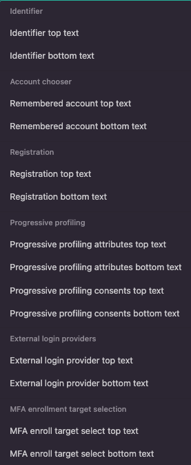
The list of communication input fields by journey step is available in the tab's drop-down:

Additional text fields
Each customer journey preview has different additional text fields that will update when you switch previews.
The text fields support basic Markdown syntax.
Code snippets
Code snippets are short, reusable pieces of code that you can quickly add to your branding customizations, helping you implement common functions without writing them from scratch.
How to use code snippets
- Start by logging into the Admin Console using an admin account.
- From the left-hand menu, select Policies > Branding.
- Switch on Advanced mode.
- Place your cursor where you want to add the code. On the right-hand side of the advanced editor, select Code snippets and choose from the list.
For example, the 'login selectors' snippet provides examples of CSS selectors for styling the login components. By using these selectors, you can easily customize the appearance of the login elements to match your brand’s visual identity. - Modify the snippet as needed to fit your specific requirements.
- Preview your changes to ensure everything works as expected.
Updated about 2 months ago
